


Get started selling products online with our free downloadable workbook.
The email you entered is invalid.
Thank you for subscribing.
By entering your email, you indicate that you have read and understood our Privacy Policy and agree to receive marketing from Squarespace.
Once you have an understanding of what mobile commerce is and why it’s important for your business, you still need to build your store and get it ready for mobile selling. The right website-building software will make this process an easy one—and even do some of the mobile optimization work for you.
Follow our checklist below to learn the basics of designing a mobile-friendly online store in eight steps.
1. Choose your ecommerce platform
If you’re at the very beginning of your ecommerce journey, the first step is to choose how and where you’ll set up your online store. Pick a platform that makes customizing and optimizing your store easy, so that you can focus your efforts on growing your business.
Squarespace allows you to schedule product releases, manage inventory, connect your store to social media, and handle shipping logistics, all in one place.
2. Upload products and descriptions
Once you have the key pages of your website set up and product photos ready to go, you can start listing products in your store. Your photos should be high-quality and highlight the unique features of your products, even on a smaller screen.
Write product descriptions that fit your brand voice while touching on important details customers need to know. If you’re selling handmade jewelry, for example, list the materials you used and care instructions. Keep descriptions relatively short and to the point so that they don’t require too much scrolling on a smaller screen.
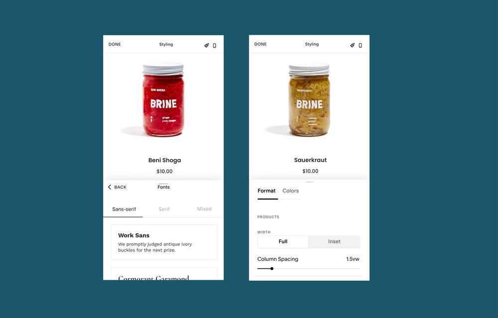
3. Decide how to optimize your site for mobile
Many website building platforms will already have some amount of built-in mobile optimization to ensure your site works well across devices, like an adaptive or responsive design. Every Squarespace site is built with responsive design, meaning that it will load quickly and fit any screen size. Images and text will automatically resize or shift based on the size of the screen without causing visual errors like cut off photos.
You might also decide to design a site specifically for mobile, sometimes called a mobile-only site. Unfold Bio Sites are a simple and fast way to design a branded mobile only site that links to your store and products for easy access on phones or tablets.
4. Make it easy to navigate your store on mobile
When it comes to optimizing your site features for mobile, think like a customer. Make finding your store feel intuitive with a clear menu, and make it easy to browse your store by defining categories, allowing for filtering and sorting items, or adding a search feature.
The fewer taps it takes for a user to find and view your products on any device, the easier it will be for you to make a sale. Having a seamless website experience also leaves your customers with a more positive impression of your site and brand overall, which builds trust and sets the stage for return visits in the future.
5. Place features and text with a phone screen in mind
Optimizing for mobile isn’t just about accounting for a smaller screen, it also includes optimizing for the reach of your customer’s fingers. Your website text should be readable at a smaller size, and your images should convey your desired message or product features on a smaller screen.
Website features like the navigation menu or search bar should be easy to identify and reach with a tap of the thumb so that users aren’t fumbling with their phone or accidentally clicking on the wrong links.
6. Make mobile transactions simple and quick
As many as 69% of customers drop out during the checkout process. Not every reason for an abandoned transaction is within your control, but your site design is. Long forms that add more steps to the checkout flow or send your customer off of your site could lead to someone dropping out part way through. Make information about returns and exchanges accessible from checkout so that customers feel secure in making a purchase.
You can customize the checkout on your site so that it’s easy to move through the steps. If you want to give customers the option to sign up or log in, include a choice to check out as a guest. Even better, offer express checkout options that autofill address information and reduce the number of clicks required to place an order.
7. Integrate your store into your social media
Once you’ve done the work of making your store mobile-friendly, you’ll be able to capture new customers. Integrate your store into your social media by linking out to it from your profile, allowing customers to shop directly through the social media platform, and using your platform to highlight your products and brand.
Social commerce is a great way to grow your mobile commerce sales because it means your products live where customers are already spending a bulk of their time online. They can make a purchase but don’t have to stop browsing, making the transaction feel seamless.
8. Consider adding features that can grow your sales
Now that you’re up and running, you can start adding features to help you grow your sales.
Try these common strategies:
Add an automation that sends an email if a customer abandons their cart
Create an automated welcome email that comes with a discount code
Build a relationship with your customers by starting an email newsletter
Include a “buy now, pay later” option so people can pay off a purchase over time
Turn your website into an app so you can send notifications to customers
Putting together a professional ecommerce website that’s optimized for mobile sales is simple if you follow the steps above. If you’re new to mobile commerce, check out our comprehensive introduction to mcommerce.