Download a free workbook to help you design your site with confidence.
The email you entered is invalid.
Thank you for subscribing.
By entering your email, you indicate that you have read and understood our Privacy Policy and agree to receive marketing from Squarespace.
There are plenty of benefits to having a simple, minimal website design. You have fewer pieces to finalize to launch your site and fewer elements to update and maintain. And simple design can translate across brands, whether your style is bold and bright or elegant and understated.
Check out the website examples below to get started or inspired for your own simple design.
1. Manual
Minimalist design is a perfect option if you’re focused on selling or promoting just one thing—like a product launch, an event, or a service. The simple design of a site like this one keeps visitors focused on what you want to share and your call to action (CTA).
If your launch isn’t ready yet, the page can be easily repurposed into a Coming Soon page with the option to sign up for email updates or pre-order an item.
2. Camdez
Even if you’re selling more than one product, you can keep a minimalist design aesthetic by grouping your items into categories or collections. That helps users by making it easier to browse your shop and allows you to create white space in your design.
3. Clune
The Clune template is an example of using minimal design to promote a brick-and-mortar service business. A unified color palette, ample spacing between page elements, and cohesive images give the design a polished simplicity.
4. Radian
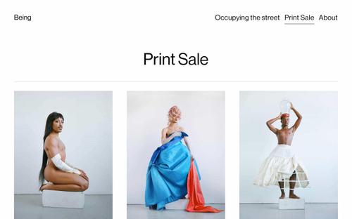
Minimal design is also ideal for visual creatives who want to put their work front and center. Picking a few of your favorite works to highlight gives visitors a quick summary of what you do, while the simple navigation points them to learn more about you or reach out about your work.
5. Suhama
Minimalist design doesn’t have to be quiet or black-and-white. The Suhama template is a great example of a resume or portfolio site that communicates bold personality while keeping the design simple. Like in the Elliott template above, the focus point is your experience, but customized to fit a non-visual creative.
6. Cailles
Combining spare, bold text with a central image allows you to keep your design minimalist without sacrificing any key details. Here the text is still the focal point because it’s given plenty of white space and is more vibrant than the background image. But the image still hints at the personality and aesthetic style behind the brand.
How to design a minimalist website
No matter what starting point you choose for your website, there are a few ways to help you quickly apply a simple, minimal look to your pages.
Choose one point of focus. This could be a central image or a bold block of text, like in the Elliott and Suhama examples above. Build your page around this central point.
Have a goal in mind. Think of the one place you want to send your site visitors, whether that’s your shop, a contact form, or another page on your site. Focus your copy and design on leading your visitors to that point.
Choose one or two main colors. Sticking to a couple of colors, or a few shades of the same color, will keep your design from looking too busy, like in the Clune template.
Keep the fonts and typefaces simple. Like a simple color palette, sticking to one or two similar fonts will keep your visuals clean and minimal.
Pay attention to negative space. Negative space, sometimes called white space, is a blank area intentionally left between content on a page. Minimalist websites tend to have more negative space in their designs to avoid crowding the screen.


