


Download a free workbook to help you design your site with confidence.
The email you entered is invalid.
Thank you for subscribing.
By entering your email, you indicate that you have read and understood our Privacy Policy and agree to receive marketing from Squarespace.
Good user experience (UX) is fundamental to designing a website. When people can easily interact with your site and find what they’re looking for, they build trust in your brand. Good UX also optimizes your website for search engines, making it more visible online.
Learn more about creating an effective user experience, from designing with UX in mind, to optimizing your website’s calls to action.
What is UX design?
UX design is meant to deliver a fulfilling browsing experience that stays relevant to users’ needs. It is concerned with how a website works, how easy it is to interact with, and how logical the navigation around the site appears to be. Good UX will maximize customer satisfaction by delivering practical and uncomplicated interactions on your website.
Learn more about UX for websites
Why is user experience important?
To the user, UX is important because it helps them get what they need from your website. When they come to a site, they are curious and looking to gather information and engage with content, or they’re shopping and looking to buy. An effective website will make it as simple and clear as possible for them to find whatever they’re interested in, learn more about it, and, ideally, make a purchase.
If you deliver a great user experience, people are more likely to come back and keep shopping, and recommend your business to their friends.
Developing positive UX is also essential to search engine optimization—maximizing how high your website appears in search engine results when a potential customer types in a particular keyword. The better optimized your site is, the more potential customers will see it. This is key to growing your brand.
The two main UX-related factors affecting SEO are:
Bounce rate. This is the number of people who leave your site after only visiting a single page. The better the UX, the lower your bounce rate should be.
Page dwell time. This is the average length of time people stick around on a particular page of your website. If the UX is good, they’re more likely to stay a while.
You can address these factors by ensuring that your site has:
A fast load time. Keeping file sizes small and making sure your site makes the fewest possible server requests—i.e., the number of times the browser has to request files from your site—by not overloading it with unnecessary images will stop people from leaving before the page loads.
A great landing page. A well-designed landing page will convince customers that browsing your site is worthwhile by speaking to their needs, focusing on the offer, and enabling prompt sign-up to mailing lists or immediate purchase.
Good mobile responsiveness. More than 90% of users browse the web on their mobile phones, according to Statista, and account for over half of all web traffic. Optimizing for mobile will mean you don’t lose the majority of your audience.
User-friendly URLs. URLs that help users understand the hierarchy of your site—by applying the “/” symbol to divide subcategories and using clear language to name your pages—make subcategories easier to find and remember.
With mobile-friendly design and a suite of integrated features, Squarespace websites come pre-built for search engine optimization.
How do you design UX?
There are four key UX stages you need to go through before you launch your website.
Stage one is the research phase. Integral to the UX design process, it is concerned with analyzing target audience behaviors, motivations, pain points, goals, and needs. UX design is as much about crafting the narrative—your brand message—as it is about website navigation and appearance. Put together a list of the content you want to include on the site (called a content inventory), then rank the items in order of importance. The more you work on this research, the clearer your UX strategy will become.
Stage two is the wireframing phase. A wireframe is like a blueprint or outline for your website. It will organize information in a way that’s easy to navigate, along with an overview of what’s going to be on those pages.
By focusing on top-line information—such as page titles, subheadings, menus, buttons, and layout—you’ll be able to understand how the website is ordered at a glance. The wireframe will help you to troubleshoot any potential issues with navigation.
Stage three is the user testing phase. Testing your website allows you to see if the wireframe actually delivers the user experience you thought that it would. During this phase, you can eliminate problems and improve on the UX design by trying out various designs and layouts.
If you've followed the steps up to this point, user testing will be extremely informative, and will ultimately help you ensure that you get maximum results from your website. This is where you iron out usability problems, which, in the long run, will save you both time and money.
Website builders like Squarespace include user interface (UI) testing as part of the package, which puts you one step ahead. However, if you want your website to deliver from day one, you should definitely carry out a full UX test by consulting your potential customers to learn how they feel about the prototype website, prior to launch.
Stage four is the implementation phase. This is the point at which you lay out the final version of your website and put all the elements in place.
Make sure you have at least three pieces of high-quality content ready to go on your site. When your first users land, they need to see something valuable to them if you expect them to come back.
Encourage users to sign up to your email list so that you can create an immediate long-term connection with them. Once you've built a mailing list, it's time to engage your audience. Squarespace’s integrated email marketing tool makes it easy to send emails that look like an extension of your brand and website. Try Email Campaigns and send your first three campaigns for free.
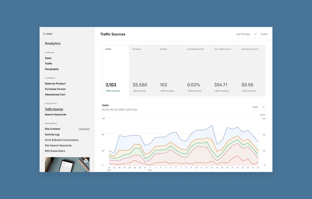
Finally, make sure to start using your analytics tools right away so that you can see how much traffic you’re getting and where it’s coming from. By measuring your website traffic and performance, you can tweak your UX to better support your business goals.
Why does a website need calls to action?
A call-to-action (CTA) button is an interactive aspect of the user interface (UI) that enables people to take certain actions on your website. The two main goals of CTA buttons are to generate leads and to sell products.
Buttons should be obvious and appear clickable—their primary goal is, after all, to get people to click them. Make sure any text on your CTA buttons is easy to read and clear about what action you want the user to take. Use direct language like “Buy Now,” “Learn More,” or “Sign Up,” that will make the purpose of your CTA buttons obvious. Finally, leave white space around your CTA buttons so that they don’t get lost on the page.
Looking for more design guidance? Learn about best practices for mobile-first website design.