


Download a free workbook to help you design your site with confidence.
The email you entered is invalid.
Thank you for subscribing.
By entering your email, you indicate that you have read and understood our Privacy Policy and agree to receive marketing from Squarespace.
The colors, typography, and imagery that go into your website design are the building blocks of your online brand. These elements can help convey who you are, and what you stand for, to your target audience.
Whether you’re new to website design or revamping an existing site, learn how to create a signature style without hiring a web designer.
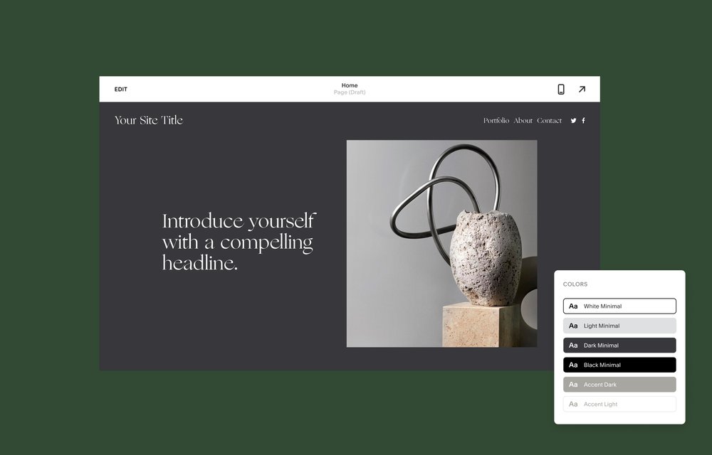
Choosing a color palette
When you’re choosing a color palette for your website, spend some time looking at other brands or portfolio sites for inspiration. If you’re launching an online plant shop, for example, you might look at competitor brands to see how you can differentiate the look and feel of your online store and stand out in the marketplace.
Color also plays an important part in the user experience of a site, and finding the right color combinations is central to good web design. For example, choosing a color palette that makes the CTAs on your website obvious will also make your site easily navigable for new visitors. There are five main approaches for picking colors:
Complementary colors: These are opposite each other on the color wheel; such combinations include a warm color like yellow juxtaposed with a cool color like violet.
Split complementary colors: This splits one color into its two adjacent colors on the color wheel and then matches that pair with the original color’s complement; for example, you might split red into red-orange and red-violet, then pair them with red’s complementary color, green.
Triads and tetrads: Any three or four colors, respectively, that are the same distance apart on the color wheel, e.g., red, blue, and yellow (triad), or orange, red, violet, and blue (tetrad).
Analogous colors: These combinations sit next to each other on the color wheel, e.g., red, red-violet, blue-violet, and blue.
Monochromatic colors: A single-color scheme that uses various shades, tones, and tints of an individual color.
When you’re selecting color combinations, keep it simple and limit the number of colors you choose. As a rule of thumb, stick to three or four main colors at the most.
Selecting your brand fonts
Like color, typography informs our opinions and shapes the way we feel about the businesses we interact with. Here are some of the different styles of fonts you can choose from.
Serif fonts
These classic typeface styles have a decorative foot (i.e., a serif) at the end of each character’s stroke. Examples include Times New Roman, Palatino Linotype, or Georgia. They’re great for long blocks of text, like body copy on your website, and have a formal, authoritative quality to them.
Sans serif fonts
“Sans” means without, so “sans serif” means a font that has no decorative foot. Examples include Helvetica, Arial, and Verdana. They’re modern, easy-to-read, and simple.
Slab serif fonts
Geometric, blocky, and confident, slab serif fonts are great for logos, headlines, subheadings, and even body text. They include Rockwell, Soho, Memphis, and ITC Lubalin Graph.
Script fonts
Script fonts look like cursive handwriting. They can be difficult to read in small format, but script fonts can work well on a landing page, as headlines or subheadings.
Your brand logo should offer a good starting point for picking your website’s main font. You don’t have to literally use the logo font in your other typography, but you may want to use it for headline-level text to create brand continuity. If you don’t already have a logo, Squarespace’s free logo maker can help you get started.
Read an expert’s guide to choosing fonts
Using icons on your site
Icons are pictures that represent words or concepts—they use a simple image to convey complex meaning. Think about how many of the world’s biggest brands you can identify just by looking at a swoosh or a little blue bird.
Because they suggest so much with so little, icons work well on websites to draw the reader’s attention to key pieces of information and guide the user experience. Think about the icons used as links to a business’ social media pages. Those icons are so recognizable that, when they appear on any web page, users know exactly where they’re headed when they click on them.
To create a strong icon for your business, consider how you want to present your brand and what impressions you want to create. The shapes you choose should reflect your overall aesthetic and messaging. For example, if you have a soft color palette paired with a modern font, you may want to stick with simple icons that rely on single lines to create a shape. Alternatively, if you have bolder, brighter branding, you may want to try out geometric shapes that reflect a straightforward style and tone. With icons, a picture can be worth a thousand words.
Learn more about creating an effective user experience on your website.