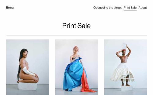
The company is ditching quiet friendliness for a very New York swagger.
How do you brand your business when your business is “helping any business make its own branded website?”
Until recently, Squarespace, the 15-year-old web publishing and design platform, had a fine solution: stylish but unassuming minimalism. Its logo and type felt round, open, and calmly still–like an empty art gallery or yoga studio, solicitously available to accommodate all comers with soothing, upscale grace.
That’s over now. The new Squarespace identity is still minimalist, but less like a yoga studio and more like a samurai sword animated by Saul Bass: it’s hard, sharp, elegant–and always moving. In fact, according to Chief Creative Officer David Lee, that dynamism is the point. “We really wanted to figure out if someone could identify Squarespace purely from its motion,” he tells Co.Design.


